A recent blog post on MS's blogs,
here shows the differences between the beta and release candidate gui:
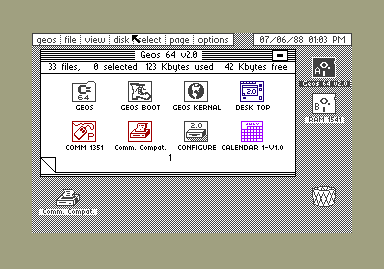
I was looking at their UI and thinking about it, and you know what it reminds me of? This:
That's GEOS on a Commodore 64, in about 1988. So, Metro is GEOS 2012. What do you guys think? Is it time to go back to monochrome? Sick of high color photo-quality icons and long for monochrome high-contrast user interfaces? Not me. But it seems all the cool UI designers are doing it. Mac OS X 10.7 LION is the least colorful version of Mac OS X yet, and it all seems to be fading into gray on silver on carbon, whether its the removal of color from the icons in the finder's quick-icon bar, or the complete disappearance of the scrollbar, the themes for this year's cool UI designers are "chromeless", "monochrome" and "minimalist".
Color me unimpressed.


No comments:
Post a Comment